I N D E S I G N • P H O T O S H O P
S T Y L E G U I D E
M A N U A L
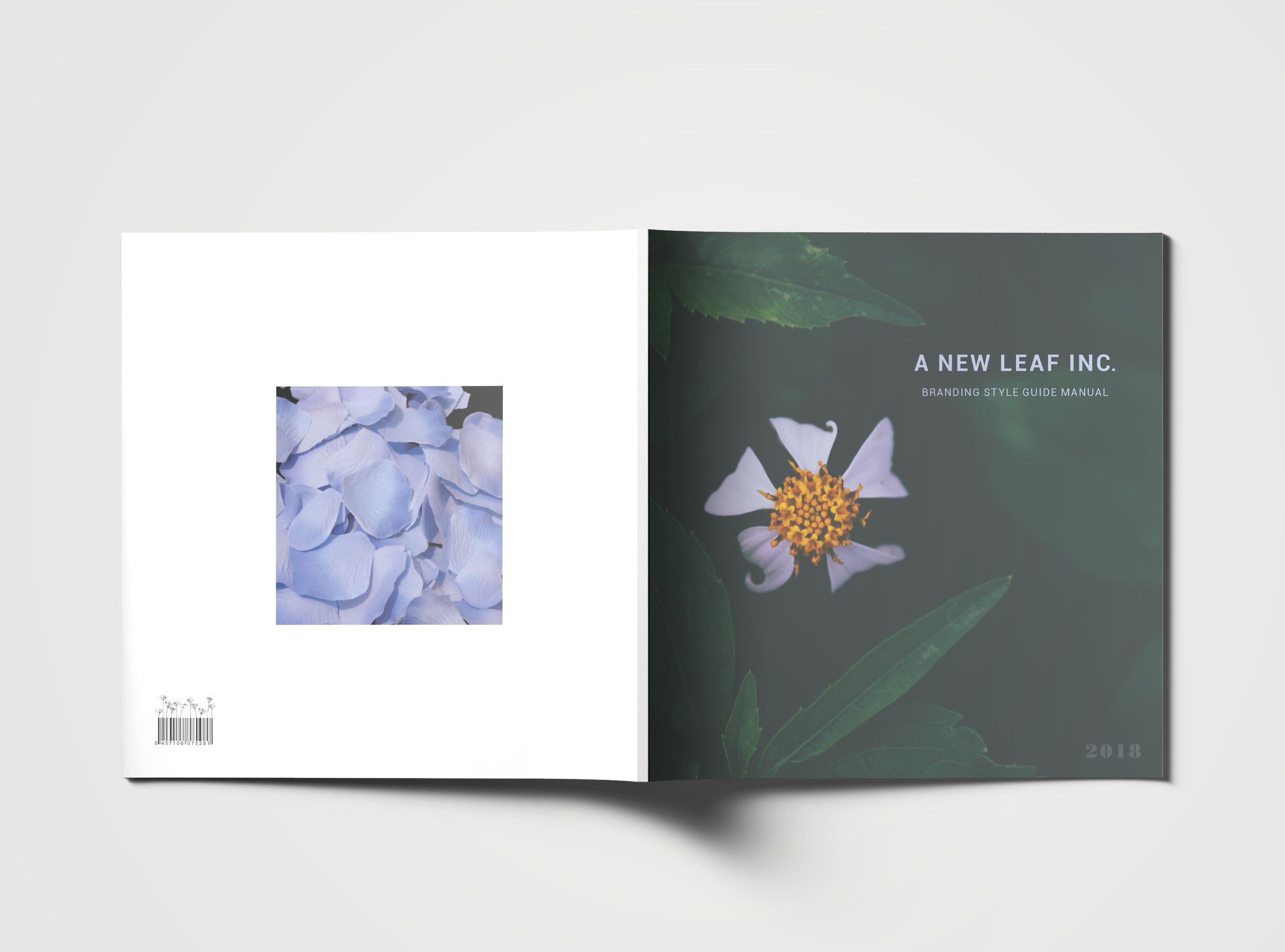
In this design we were required to create rebrand an existing business in Chicago, IL. I then had to create a style guide manual, and advertise our new brand with an event.
Within the manual, the new logo renders are dissected by typeface, weight, and color. Rules on logo usage: color, size, and clear space are explained thoroughly throughout the manual.
The final result is inspired by nature and the beautiful colors we find all around us. The color logo has an orange center, bright like the sun or the wings of a monarch; balanced with light purple petals. The combination of these represents the day and night, the light and dark the is necessary for the growth of life.
The typefaces chosen are Better Together and Aracne Condensed. Both typefaces are organic; however, Better Together is a script type that evokes a natural yet fun ambiance. Paired with Aracne Condensed, a clean and modern type, these types create a harmonious logo.


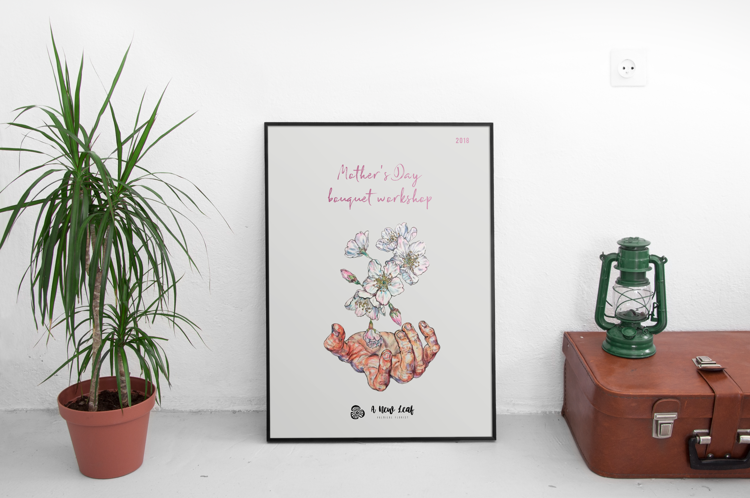
To further this design influence, I created mockups to display how the new brand identity would reflect across all platforms, including: iPad, web, mobile, magazine cover, stationary, and storefront.
These mockups exhibit the use of the new brand identity and how it should be used in future projects, if there are any questions about usage thankfully there is a carefully thought out style guide manual one can reference.


